
SHAKESPEARE BASH’D
Shakespeare Bash’d
Season Branding
Shakespeare BASH'd is an award-winning Toronto-based company producing work by Shakespeare and his contemporaries. They are known for the lively and inviting atmosphere they create with all their productions staged in bars around the city.
Each year, I create digital and print material for the season. I draw inspiration from the text or themes of each piece and use font, colour, or a stylistic theme to tie the various shows together.
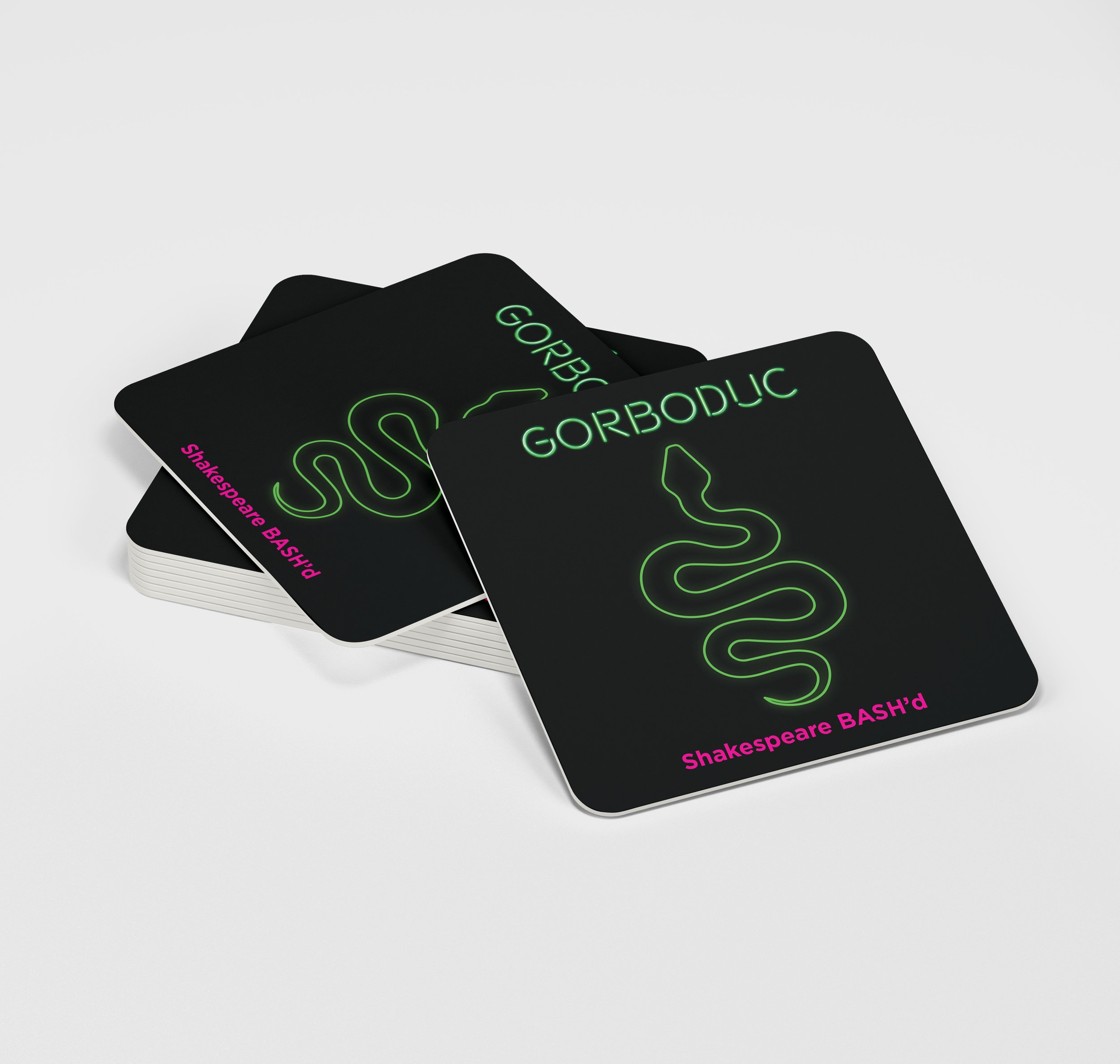
I use coasters instead of the traditional postcard to highlight the fact that the shows are performed in bars. This has become a great conversation piece when the coasters are handed out at festivals or in the Fringe tent.
2017 Season
For the 2017 Season, I was tasked with creating four animalistic images to represent each of the play. I was also asked to use bright, vibrant colours and an exciting, electric font. Looking to the characters and themes of each play, I choose a snake, fox, boar and rat. Inspired by the simple lines of neon signs, I created outlines of each animal as well as custom letter forms for the titles.

2016 Season
The Comedy of Errors opened the 2016 season and we wanted to capture the madcap, revolving-door nature of this play about twins and mistaken identity. Drawing on the themes of the plays, I set about to distill iconic images and concepts to their most basic forms. Playing with shapes, patterns, and negative space, I designed simple geometric forms to represent each of the plays.
